Talk:Welcome to Citizendium/Archive 1
Should we add some extra entry point articles to the main page? Please add your ideas below. --Larry Sanger 15:47, 13 March 2007 (CDT)
Probably we should stick to lists, overviews, and summary-type topics. Otherwise we end up making decisions about what individual topics within a field are most important--when the decision is almost always going to be completely arbitrary. That rules out the following suggestions (all of which are, obviously, extremely important topics for articles):
- Topics that are (though important) not broad enough to include: Evolution - Tectonics - Magnetic North - e and i and pi - Isaac Newton Albert Einstein - Adam Smith and Karl Marx - Montessori Teaching - Psychoanalysis - Football (soccer) and American Football :) - Natural Law
--Larry Sanger 20:43, 13 March 2007 (CDT)
I've proposed that we start writing "catalogs"--please have a look. --Larry Sanger 13:34, 24 April 2007 (CDT)
- Natural Science
- Astronomy - the planets or list of planets or catalog of planets; also, catalog of Messier objects
- Biology - catalog of most abundant species or catalog of common zoo animals
- Chemistry - the elements or catalog of elements
- Computers - most common programming languages or catalog of programming languages; catalog of programming algorithms
- Earth Sciences - catalog of landforms
- Engineering - famous engineering projects or catalog of engineering feats
- Health Sciences - catalog of body parts - catalog of common drugs - human body - how drugs work - human physiology
- Mathematics - catalog of important mathematical facts (definitions, theorems, constants, etc.)
- Physics - catalog of important physical laws - Light - Sound
- Social Sciences
- Anthropology - catalog of ethnic groups
- Archaeology - catalog of famous archeological sites
- Economics - catalog of famous economists or maybe roster of famous economists
- Education - catalog of famous universities - catalog of education theories
- Geography - countries of the world (or?) World Gazetteer
- Law - catalog of legal subjects - catalog of U.S. Supreme Court decisions - catalog of legal scholars or maybe roster of famous legal scholars
- Linguistics - major world languages or catalog of major world languages - language - language acquisition
- Politics - political ideologies or list of political ideologies or catalog of political ideologies
- Psychology - catalog of famous psychologists or roster of famous psychologists - catalog of psychotherapies
- Sociology - catalog of social institutions
- Humanities
- Classics - catalog of important classical writers - ancient Rome - ancient Greece
- History - catalog of civilizations - outline of world history or timeline of world history
- Literature - catalog of famous novels - catalog of famous English language authors - catalog of famous authors
- Philosophy - catalog of famous philosophers - outline of the history of philosophy
- Religion - catalog of religions
- Arts
- Architecture - catalog of famous buildings - catalog of famous architects
- Music - catalog of musical genres (or whatever) - history of Western classical music - timeline of Western classical music - catalog of musical instruments - catalog of famous popular music performers
- Theater - catalog of famous playwrights
- Visual Arts - catalog of famous painters - catalog of famous sculptors
- Applied Arts
- Agriculture - catalog of crops
- Business - catalog of major world corporations
- Healing Arts - alternative or complementary medicine - catalog of complementary medicine - catalog of common herbal supplements
- Journalism - catalog of major world newspapers
- Library and Information Science
- Media - catalog of famous actors
- Military - catalog of modern weaponry
- Recreation
- Games - catalog of popular games
- Hobbies - catalog of popular hobbies
- Sports - catalog of popular sports
How about quit trying here to find one or two additional specific lists per topic and instead add one additional generic entry per topic (maybe even as an icon) which leads to a "Most commonly looked up in XXXXX" page. This might be generated automatically from search results (using the Workgroup association as criterium where to list it), but I'm not sure if we really want that (who knows what comes out of that). Alternatively we could create that article based on our opinion what non-experts in the topic would most probably want to (or should) look at. So for Physics (where I'm non-expert) I could imagine links to Speed of Light, Fusion, Einstein, Entropy, ... on such a page. Would make the proposal process here less of a problem. --Markus Baumeister 13:58, 14 March 2007 (CDT)
One problem with the suggestion is that it is the sort of thing that CZ is set up to counteract! The Internet is full of projects that automatically aggregate popular opinion. What people are looking for in CZ is meaningful, human-created, reviewed information. Speaking for myself, I'd be much more interested in seeing a link to an outline of the history of the world than "most-searched-for history topics." --Larry Sanger 14:10, 14 March 2007 (CDT)
Sorry to ask, but you did read past the forth line of my proposal (past the "I'm not sure if we really want that"), didn't you? --Markus Baumeister 19:09, 14 March 2007 (CDT)
I admit that sometimes I do read some messages rather quickly, if I have time to answer them at all. Anyway, even a human-constructed list of "top X articles" is of only limited interest and value: we actually recently deleted a whole set of such category pages (e.g., we removed all articles from Category:Philosophy Workgroup (Top)). Anyway, of more interest to most users and contributors is something relatively specific, not generic. For both groups of people, "top philosophy articles" won't be as interesting as "outline of the history of philosophy" (for example). --Larry Sanger 19:46, 14 March 2007 (CDT)
Why not a list of most searched terms that did not find a hit in CZ? Then we could build content to satisfy those search terms. Seems like that would be a good way to generate content that people want. --Jim Schrempp
Workgroup icons
I didn't comment when they appeared (not at all like me!), but I love the icons and the new look to the Main Page. It's gorgeous altogether and really getting distinctive.However, I think the buttons could be played with- I admit it's idiosyncratic but every time I see NS I think it's my initials, and I will spare you my reflexive read of "AAS". What about just N for natural sciences and AA for Applied Arts & Sciences?, or can we have symbols that are not letters? Are there any universal symbols for these? Nancy Sculerati MD 12:07, 18 March 2007 (CDT)
- We can use anything at all. The changes would be trivial since I have all of those files as layers in photoshop.
- Another aspect that struck me recently is the sciences blue (for boys) and the arts pink/red (for girls) subliminal message. I think it could be avoided by removing the red/pink for arts, especially since it is a terrible match with the green AAS from a colour blindness perspective. Although, with respect to colour blindness, I'm not sure if we need to consider this more as long as we have symbols or letters too.
- With regard to acronyms, is AA any better than AAS? Or is it OK to imply all who participate in the applied arts are alcoholics? ;) Chris Day (Talk) 12:23, 18 March 2007 (CDT)
Well, nice little icons would be better than letters anyway. NS => test tube. SS => idealized person/human head. H => book. A => tiny but still recognizable reproduction of some famous piece of art. AAS => bridge. R => joystick; or generic ball. --Larry Sanger 12:31, 18 March 2007 (CDT)
- [Edit Clash] By the way, I had originally considered pictorial rather than letters, but did not want to waste time if the buttons proved to be unpopular. The letters were just the easy option. Obvious chioces might include a book for humanities, a flask for natural sciences (or cartoon atom), paint palette for arts, possibly a drafting compass for applied, a football of sports? You get the idea. What best represent these supercategories? If you come up more ideas I can show you what they would look like in practice. Chris Day (Talk) 12:36, 18 March 2007 (CDT)
It's a great button. The problem with recreation as a category is that includes everything from antique collecting to the dog and cat and tropical fish fancy to stamps & coins- as well as sports and games.I think this is good for now, but maybe someday it will be the sports button and we'll have something more abstract for rec. Nancy Sculerati MD 18:02, 18 March 2007 (CDT)
- Why not more abstract now, but what? I'll sleep on it. Any ideas welcome. Chris Day (Talk) 20:34, 18 March 2007 (CDT)
Tried a Roman viaduct for the applied arts but is a dead loss for the small buttons. ![]() . back to the drawing board. Something like cisco systems logo might work. Chris Day (Talk) 00:26, 19 March 2007 (CDT)
. back to the drawing board. Something like cisco systems logo might work. Chris Day (Talk) 00:26, 19 March 2007 (CDT)
About all I can think of is the infinity symbol! Or an asterix, I don't know that either is better. I think the buttons are great. If you made them 20% larger would they still work? The viaduct might work then- or maybe a roman arch. I admire both your photoshop skills and artistic eye. Nancy Sculerati MD 05:04, 19 March 2007 (CDT)
Hi Chris,
Whatever you do, can you get the buttons done fairly soon? In the interests of presenting a good face to the public for launch? --Larry Sanger 20:34, 21 March 2007 (CDT)
- Sure do we have a date? Chris Day (Talk) 21:38, 21 March 2007 (CDT)
- I'd prefer not to answer that question for very mysterious reasons. The sooner the better, please. --Larry Sanger 23:53, 21 March 2007 (CDT)
I have been playing around with three different buttons. Can i get some feed back on the ones below? Thanks Chris Day (Talk) 14:36, 23 March 2007 (CDT)
Hi Chris, thanks so much for your work on these. I like the NS, SS, and Rec icons now on the front page. I don't recognize what the AAS icon means (I'm really an ignoramus about some things). As to the new ones, what would be using the large icons for? As to the smaller icons, I prefer A to E; F to B (simply because it's darker); G to C (I can't tell what C is supposed to be without the larger icon above it); and D to H (H has no definite associations, doesn't seem to suggest recreation particularly). A book for humanities and a paintbrush for Arts would do it; a bridge for AAS, but I'm not so sure about that one. --Larry Sanger 14:47, 23 March 2007 (CDT)
- The current AAS one on the main page is a dud. it was meant to be a Roman viaduct. Instead it looks like a blob. I intend to redo it.
- As far as the size is concerned the big ones will never be used. In the table above, it was just to make it easier to see. FYI, the small and big versions above are the exact same file. Thanks for the comments, will try and finish up the others soon. Chris Day (Talk) 14:52, 23 March 2007 (CDT)
While you're in designer mode, could I ask you to do something else? Could you add the word "beta" in some fancy way to Image:Logo400gr.jpg as well as Image:Logo900gr.jpg, and for use on [1] ? That would be great! --Larry Sanger 15:08, 23 March 2007 (CDT)
- Assuming you like the beta logo that is already on the main page here are two options.
- I can probably create anything you want so if these are not the sort of thing you had in mind, please suggest away. Chris Day (Talk) 15:49, 23 March 2007 (CDT)
These are really nice. Good work. My preferences are the same as Larry's except that it really bothers me aesthetically that the flask and the hand have such different orientations. I'm probably alone in this, but I would like to see the flask on A mirrored vertically. --Joe Quick (Talk) 15:53, 23 March 2007 (CDT)
- I can easily flip the flask. here is a more fun beta version. Chris Day (Talk) 16:06, 23 March 2007 (CDT)
Wow, great! Can you do the diagonally oriented "beta" but without the nails? Let me see now... I'm not sure I'll want to stick with the nails, but I don't like the "beta" being horizontal, potentially interfere's with a first-time user's being able to recognize that it's a key. But let me try it out on the front page! --Larry Sanger 16:34, 23 March 2007 (CDT)
- Got to run now. I replaced the main page picture with your preference. Any tweeks i can do later, if necessary. Chris Day (Talk) 17:10, 23 March 2007 (CDT)
I admire your work, Chris. I agree with both Lary and Joe about specific preferences- except I think the different orienations of the hand and flask are better, because they give more information with a quick glance that identifies each uniquely. Do they have to be next to each other on the list? That's what makes the different orientation disturbing, those two are the most grossly alike-but flipped. The hand could be used for applied arts or humanities if you could think of switches. I don't think it's a natural symbol for the Social Sciences, maybe a crowd would be - or two adults facing each other. Nancy Sculerati MD 16:45, 23 March 2007 (CDT)
- I'll try the heads facing each other. In general people look like blobs on the tiny buttons. The hand is very distinct. But i agree it could easily be AA or H. Chris Day (Talk) 17:10, 23 March 2007 (CDT)
- Or just a single head. --Larry Sanger 21:14, 23 March 2007 (CDT)
- Nancy could definitely be right about the orientation, but as it stands, NS and SS are next to each other on the workgroups page. I like G for social sciences, so the hand would be free but a hand for applied arts or humanities strikes me as strange. I like an open book for humanities. Dunno about AA. --Joe Quick (Talk) 01:16, 24 March 2007 (CDT)
I think the hand works fine for applied arts (except for library science, but even there we have writing, all by the hand of man, so to speak.). The hand does not suggest social science to me in any way, but human faces would, especially if more than one and interacting-two profiles talking, facing each other could do it, maybe - for social science. The ball is good for recreation, the flask is great for natural sciences, a paint brush for Arts and an open book for the humanities. Unless you can think of better, Chris. Nancy Nancy Sculerati MD 12:19, 24 March 2007 (CDT)
- OK, now live on notice board means a timline is not so relevant. Will get up new buttons as soon as possible. Chris Day (Talk) 14:47, 25 March 2007 (CDT)
I hope these icons will do for now? The bridge and art palette could be a lot better. Still struggling to make shte heads looks anything other than blobs on the small button. Chris Day (Talk) 03:27, 26 March 2007 (CDT)
What good work! If you make the heads on the small button black (or dark-high value,) rather than the space between, I think it might then be obviously two heads. It's coming across as a trophy because the space between is what's emphasized. One reason I like the hand better for Applied Arts is because of the popularity of the internet for health and healing arts topics by the public (I can give you references, in general this is said to be the biggest use of internet for people seeking general academic-type information)- the bridge is more strictly engineering. The hand works for each major subdiscipline listed under Applied Arts. No strong opinion on its orientation. Nancy Nancy Sculerati 09:54, 26 March 2007 (CDT)
A huge improvement--thanks so much, Chris. --Larry Sanger 09:18, 26 March 2007 (CDT)
I still like G (from above) for SS. In the smaller size, the human silhouettes are much clearer. --Joe Quick (Talk) 12:18, 26 March 2007 (CDT)
- Hi Joe, I think you might be right. If I made the silhouettes more black then G could be even better. It is very hard to get a face to look like a face on the small button. Everything to date looks like a blob. Chris Day (Talk) 12:30, 26 March 2007 (CDT)
I like #2-the walking figures. But both are good. Nancy Sculerati 14:14, 26 March 2007 (CDT)
Yeah, I definitely prefer the walking figures, although the face is also much clearer now. I also really like the new Arts button, BTW. Great work on this project. --Joe Quick (Talk) 23:51, 26 March 2007 (CDT)
Chris, I'd also like to chime in that you've done great work here--you've made the workgroups page and general workgroup functionality considerably more user-friendly! --Larry Sanger 10:12, 29 March 2007 (CDT)
On the issue of button size...would it be possible to use small buttons but when you hover over them the become larger? Just a thought.--Mike Hammel 10:13, 5 April 2007 (CDT)
'A place for geezers'
I would like to see a section in each topic for the memories of the people involved in the initial phases or actual events. This would not be construed as an addition to or modification of the facts... and should be understood as personal observations that may add richness to the dryness of historical fact. Many personal remembrances (WW II survivors, holocaust survivors, Freedom Marchers, space pioneers, etc) will be lost forever if not recorded soon. Ron
See CZ:Topic Informant Workgroup! --Larry Sanger 10:24, 26 March 2007 (CDT)
Interesting, I just heard something on NPR (public radio) about somebody trying to encourage anyone who has a grandfather, grandmother, father, mother, etc.. to sit down with them and videotape them as they describe the major things in their lives. It didn't matter if they were actually there or not, just what was their recollection of what happened and where they were when things like JFK was shot, Pearl Harbor, etc.. He was then asking them to send them to his website where he ws going to display them. It would be ike a living history lesson. Not sure how we would go about documenting some of this. --Matt Innis (Talk) 09:48, 27 March 2007 (CDT)
- Of course oral recollections or eye witness testimony are known to be the worst from the perspective of accuracy but there is an interesting "personal experience" perspective to be got from the exercise. Chris Day (Talk) 10:40, 27 March 2007 (CDT)
Notice Board
This has become a focal point for instruction, and we need a focal point. I have made the link to it more obvious on the Main Page. Any assistance in maintaining or increasing that emphasis is appreciated. If you disagree, and feel that the notice board should be de-emphasized, perhaps you have a better suggestion. Please make it here so that we can work together to give newcomers a way to hook into the Citizendium. Nancy Sculerati 09:49, 29 March 2007 (CDT)
It's a good idea, for now, anyway. We'll probably have to tweak the page regularly. --Larry Sanger 10:06, 29 March 2007 (CDT)
Number of articles we are working on
On the main page, it says that at the moment that we are working on over 1,240 articles, linking to Category:CZ Live. However, CZ Live only has 397 articles in it. Could you tell me where the figure comes from? Which articles are in this count but not in CZ Live? Thanks, Oliver Smith 12:26, 6 April 2007 (CDT)
- click the "next 400" link -Tom Kelly (Talk) 13:00, 6 April 2007 (CDT)
- You're right. I thought that when it said "There are 397 articles in this category", that it meant in the whole category, not just on that page. Thanks for your help, Oliver Smith 03:55, 7 April 2007 (CDT)
Developed articles
I'd also like add a link to Category:Developed Articles around the same place where we link to "Approved Articles." What do you all think? --Larry Sanger 11:46, 7 April 2007 (CDT)
P.S. If we do this we should go through Category:Developed Articles first and make sure those articles really are developed. A number of them aren't. --Larry Sanger 11:48, 7 April 2007 (CDT)
cntrl+f5 equivalent on a mac
shouldn't we list what the equivalent would be on a mac to refresh? -Tom Kelly (Talk) 20:48, 20 April 2007 (CDT)
Go ahead, list it there, Tom. You can edit this page right now! :-) --Larry Sanger 00:21, 22 April 2007 (CDT)
spam
The page contains an important mail "constables at citizendium" written in "clear text". I know it is easy to use like this. But this exposes our important mail to spammers, doesn't it. And if too much spam gets in, in long term many important requests could be lost as hard to distinguish. I guess that this is not the problem yet, but once it becomes a problem -- and surely it will -- we would have to change the address. Well, we might consider taking some anti-spam measures before it is too late. What about a little jpg picture that contains the address(I could prepare it)? Or just a standard 'crypting' like constables -at- citizendium dot org? Any thoughts? --AlekStos 07:09, 23 April 2007 (CDT)
- So, a basic anti-spam installed. Feel free to revert or improve if you find important drawbacks. --AlekStos 14:01, 23 April 2007 (CDT)
- Feel free to peek at http://mail.citizendium.org to see some stats on mail and generalize what gets through and what doesn't. Jason Potkanski 14:14, 23 April 2007 (CDT)
- Thanks. I see. Perhaps it is already far "too late". The good news is I was wrong and despite of spam the mail works. Good job. --AlekStos 01:19, 24 April 2007 (CDT)
Links to policies?
I'd love to see a link to CZ policies -- in particular, editorial ones such as formatting of entries, form of titles, use of subsections, use of quoted material in article, etc. -- linked to the mainpage. When questions come up in the course of editing or talking about an entry, it would be infinitely easier to simply refer the parties to the stated policy (which would always be available at the left), and easier for anyone in doubt to get a quick reminder of them, than at present, when many are subsections in the master policy, and at least two links away from the mainpage. It would be great too, if possible, to have these policy docs individualized (that is one entry per policy issue) and set up to open as new windows, so that, when clicked, one would not lose one's main article window. Russell Potter 11:11, 24 April 2007 (CDT)
Main page overhaul
Nancy, Russell, all--please feel free to overhaul the main page. It's due for a change. --Larry Sanger 18:32, 24 April 2007 (CDT)
Internationalization of tax-deduction wording
Under the welcome section of the main page, the first link is "for readers: About the Citizendium" and the page linked to [2] has these words: "The Citizendium is a project of the Tides Center, a 501(c)(3) nonprofit organization." That looks to me like the logical equivalent of a dreaded acronym. 501(c)(3) of what? Missing is both the name of the legislation (or whatever it is) and the name of the country in which that legislation applies (unless it's international?)
I can't find it at the moment, but I thought one of those introduction-to-Citizendium pages stated that "you" can now deduct donations from your income tax. I suspect this is another place where specific country/countries need to be mentioned to make it universally correct. Maybe that bit has already been fixed, wherever it is, or maybe I just can't find it. --Catherine Woodgold 19:14, 24 April 2007 (CDT)
- Hi Catherine- I just happened upon your notes here, and I thought I would let you know that the deductibility of donations is for US Residents. You are right- it is rather vague to just say "you" can now deduct donations...
- The [CZ:Donate|Donate] link on the side bar as well as the "Feed the Servers" header has recently been updated to a page created with information on donating to the Citizendium and the deductibility for US residends has been noted in 2 places. Also, the e-mail that goes out to donors states the following: "Don't forget-- as a project of the Tides Center, we are part of a 501(c)(3)non-profit and donations are tax-deductible for U.S. residents (if you are not a U.S. resident, please check with your local taxing authority to determine the tax treatment of your donation)."
- I just thought you would be interested to know this. Thanks! - Kelly Patterson 11:46, 10 May 2007 (CDT)
Wording of Copyright From Wikipedia
Our current notice reads "Please note that additions to those articles in the Citizendium that are marked as from Wikipedia are considered to be released under the GNU Free Documentation License 1.2 (see Project:Copyrights for details). All new articles will be available under an open content license yet to be determined."
However, Wikipedia's content is licensed under "the GNU Free Documentation License, Version 1.2 or any later version published by the Free Software Foundation" (emphasis mine).
Should we change our notice to "under the GNU Free Documentation License 1.2 or later"? It seems this would make our content more forward-compatible. --Mike Johnson 13:49, 3 May 2007 (CDT)
Link to "articles to approve"
I would like to have a link on the main page to Category:Articles to Approve. I suggest where it says "Want to work on an article heading towards approval? Browse: Developed Articles", appending "or Articles to Approve". --Catherine Woodgold 07:56, 5 May 2007 (CDT)
Amazon link
Glad to see the linkup with amazon.com - but on my browser, at least (Safari on a PowerBook G4) this displays as code, not as the box it's meant to be. Russell Potter 09:48, 5 May 2007 (CDT)
- actually, it's a glitch. Hold on. Nancy Sculerati 09:49, 5 May 2007 (CDT)
- Could someone please edit the bookstore page (the page you get to when you click on an ISBN number in an article) to say something like "When you buy anything from these sites after following a link from Citizendium, you are helping support Citizendium financially at no extra charge to you." It think it's important to be up-front about this. Also, some people after seeing this may get in the habit of regularly buying stuff through Citizendium-originated links.
- I wonder whether people have to have cookies enabled on their browsers (or something) for it to work. If so, it's a good idea to say so. --Catherine Woodgold 07:26, 10 May 2007 (CDT)
- Done. I wouldn't worry about the cookie issue. Both referral programs track sessions based on additional data in the link. Hover over the link on BookSources for more detail. Jason Potkanski 08:17, 10 May 2007 (CDT)
Moving the entry points
Should the Entry Points be moved to where the Welcome Section is now, and the Welcome Section, with the points below, be moved to where the Entry Points are?
Proposal: Redesign main page
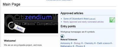
I made a brief template of possible changes we could make to the main page, just to make it look better. Can you guys take a look at this and let me know what you think?
Note: This is far from finished, but it's just to give you an idea of what I had in mind. Mike Mayors (Talk) 19:28, 12 June 2007 (CDT)
I appreciate the effort, but--sorry--I just don't see that it's that significant of an improvement. I think we need to rethink the whole entry page--probably greatly simplify the main entry page, and then create a series of other entry pages linked directly from the main entry page. More importantly, we need to make a newer and better skin for the wiki, something that someone was working on (see the forums)...not sure what happened with that...
Ori Redler had a promising design, as I recall. --Larry Sanger 19:37, 21 June 2007 (CDT)
K then, no problem. I look forward to seeing the new skin. Once its done, you can add that to the list of "Why we're not Wikipedia" :) Mike Mayors (Talk) 00:02, 10 July 2007 (CDT)
- I'd like to see an actual new, unique skin. Some people have done some pretty marvelous things with Mediawiki, they are just not included at the skins page there. —Stephen Ewen (Talk) 01:26, 12 July 2007 (CDT)
Problems
Some problems that I have with citizendium which are parcially caused by me is that when you copy something from wikipedia, and you don't fix the red links then people can get lost. I think that a new way of transfering from wikipedia is that you have to fix the red links. Jordan Goldberg 19:28, 21 June 2007 (CDT)
Insert non-formatted text here== Page needs redesign and simplification ==
All, if you are interested in the Main Page, will you please work together (or just submit a design of your own) on a brand new and highly simplified design? We will move many of the links that are now on the front page, and in the sidebar, to other (still easily accessible) pages.
I did like a design by Ori Redler from some months ago, but we never followed up on it. --Larry Sanger 22:55, 11 July 2007 (CDT)
- Would it be this one? [3]. It still needs work, but is this what you had in mind? --Matt Innis (Talk) 23:13, 11 July 2007 (CDT)
- Yes, that's the one. --Larry Sanger 08:25, 12 July 2007 (CDT)
- I like that idea. Very simple, and a few more entries, but looks good. Jochen Wendebaum 01:19, 12 July 2007 (CDT)
I got an idea! Reading about where and how to put the Beta tag, without losing sense of a "key" why not a "keychain"? Thomas Mandel 23:38, 11 July 2007 (CDT)
- Nice basic layout idea, cool idea for the keychain. :-) —Stephen Ewen (Talk) 01:23, 12 July 2007 (CDT)
- Along the "key" theme, what about keyholes or locks, as in clicking one "unlocks" the information users seek. Too hokey? Aric S. Campling 07:56, 12 July 2007 (CDT)
- This is something like what I was thinking (I have larger versions if wanted):
 Aric S. Campling 16:00, 19 July 2007 (CDT)
- Hokey, yes, but I like it! Anybody know how to do this stuff? --Matt Innis (Talk) 16:09, 12 July 2007 (CDT)
- I just noticed this too. It's a great logo. Why don't we make it into the top-left icon? --Larry Sanger 08:18, 20 July 2007 (CDT)
- I know it is doable. I also know I am the sort who just really likes very artistic web design, so long as the functions do not become non-obvious and/or complicated. I just don't think simplicity and plainess necessarily have to be one and the same. :-) —Stephen Ewen (Talk) 18:48, 12 July 2007 (CDT)
- Are we still in beta given the planned 2.0 initiatives? Can't we be in like, 0.2?--Robert W King 23:17, 12 July 2007 (CDT)
- We officially Do Not Care that beta = pre-1.0. --Larry Sanger 23:20, 12 July 2007 (CDT)
- Are we still in beta given the planned 2.0 initiatives? Can't we be in like, 0.2?--Robert W King 23:17, 12 July 2007 (CDT)
- I know it is doable. I also know I am the sort who just really likes very artistic web design, so long as the functions do not become non-obvious and/or complicated. I just don't think simplicity and plainess necessarily have to be one and the same. :-) —Stephen Ewen (Talk) 18:48, 12 July 2007 (CDT)
Oh, I think the keyring is nice! —Stephen Ewen (Talk) 00:47, 13 July 2007 (CDT)
Pat, thanks--looks better, but still not the radical simplification I was hoping for. But then, we can't really have such a simplification until we have at least partly redesigned the entry pages of, for example, the project (CZ:Project Home). --Larry Sanger 06:37, 18 July 2007 (CDT)
I just saw the redesign, and while I think it's an improvement, I have at least one suggestion for improvement: "Approved Articles" should be up very close to the top. These are our showpieces - the thing which sets us apart (in theory) from Wikipedia. Anthony Argyriou 12:11, 18 July 2007 (CDT)
- Feel free to tinker with it. I was a little nervous messing with the front page. Anyone should feel free to radically modify as far as I'm concerned. I placed the information sort of in the order I personally wanted--I imagine if you poll 10 people, you'd get ten different sets of priorities there. Anyway, why don't some of yall try your hand? I feel I've already stirred this pot enough :-)
I've just spotted the fresh design and couldn't resist experimenting :-) But my question is: does the Notice Board is a "project entree"? For regular editors the page is either in the watchlist or two-clicks-away via CZ:Project Home on the left margin. For newcomers, the Notice Board is virtually of no meaning. Do you see any other group potentially interested in having the link on the main page? --Aleksander Stos 08:06, 20 July 2007 (CDT)
Meh, get rid of it. Really, you can edit it, please do. --Larry Sanger 08:19, 20 July 2007 (CDT)
- I can't help but point out various bugs and display issues, so here's yet another one: (screenshot pending)--Robert W King 14:18, 20 July 2007 (CDT)
- Robert, do you have problems with other sites too? It seems like you have many more layout problems than others, even those using PC's. It makes me wonder whether you're missing some software. Chris Day (talk) 14:21, 20 July 2007 (CDT)
- Just seen your screenshot. That png is transparent (at least it is mean't to be. For some reason your system is substituting transparent with black? Chris Day (talk) 14:23, 20 July 2007 (CDT)
- When I click on the fullsize logo, there's a gray background.--Robert W King 14:24, 20 July 2007 (CDT)
- Nope. CZ is the only one, and I am sure I'll get the same results when I get home, but I will keep you updated just in case..--Robert W King 14:22, 20 July 2007 (CDT)
- Strange, especially since the "approved"green tick is semi transparent. I'd expect the same with that too. Chris Day (talk) 14:31, 20 July 2007 (CDT)
- Chris- I'm at home now, and it shows up the same way. The subpages template also appears to be a 50% grey/green, and the normal logo has the same background. I still see the front-page logo with the black background; it might be the way IE renders odd transparencies.--Robert W King 17:37, 20 July 2007 (CDT)
- Strange, especially since the "approved"green tick is semi transparent. I'd expect the same with that too. Chris Day (talk) 14:31, 20 July 2007 (CDT)
Forums link
Would someone please restore the Forums link at the left bar? It's very helpful and convenient (I use it several times daily, and suspect others may as well), and it's an important part of the project. Russell Potter
- This was my first reaction too. There is the "Communicate" link, however, and the target contains all useful pages. So now I appreciate lighter toolbox. Notabene, by the same logic, we could suppress the "Notice Board" link from the toolbox. It is, anyway, linked by "Communicate" and its proper place is in the watchlist. --Aleksander Stos 15:27, 20 July 2007 (CDT)
- I use the Forums link a great deal as well, and would like to see it back. Aleta Curry 18:17, 20 July 2007 (CDT)
Missing links - food, cuisine
This page is sure a lot cleaner looking than when I first joined a couple of months ago -- a great improvement! I don't see any openings, however, that would lead the casual browsing newcomer to Food Sciences or Culinary Arts (a proposed workgroup) or Catalog of French cuisine or Catalog of cocktails or any of the food articles I've worked on. Surely food, as a vital part of our existence, ought to be referenced here in some easy-to-find way. Under Sports, for instance, there's a list of difference sports, some with existing links and even sub-links.... Hayford Peirce 16:26, 20 July 2007 (CDT)
- Just an oversight? Aleta Curry 18:24, 20 July 2007 (CDT)
