Template talk:Elem Infobox
Chem_Infobox
- background1=aaccff (the color of the background)
- elementColor=xxxxxx (the color of the element square)
- elName=Helium (element name)
- elMass=0 (element mass)
- elSym=He (element symbol)
- elNum=2 (atomic number)
- eltrnCfg=1-1 (electron confguration
- no1=1 (oxidation states)
- no2=1
- no3=1
- no4=1
- properties=Describe what it looks like
- compounds=What is it found in?
- uses=(uses)
- hazard=what type of hazard does it pose?
what does element color mean?
I don't see anywhere what the definition is for the elementColor variable. Is there a set of colors which indicate something about the element or is it up to each element author to choose any color they like? I just kept a red color for my Boron page. Is this correct? Does it matter? David E. Volk 09:33, 6 December 2007 (CST)
Fix
There's a white margin on the left side that needs to be fixed. Also, I think some elements are better left justified, while some look better centered (I don't think they should all be centered). Thirdly, I think the picture being there is somewhat worthless. Instead we should be giving the period in which it resides so people can look it up in a much better formatted table, if they wish. --Robert W King 09:19, 4 April 2008 (CDT)
- What do you mean by centered? Could be another browser issue. Chris Day 10:59, 4 April 2008 (CDT)
- The white margin is still there. And I mean center-justified text in some of the tables. --Robert W King 11:06, 4 April 2008 (CDT)
- The white margin on the side is a "keepout" for the article text. Look at all the other structures in CZ...they've got 'em. The page looks crowded otherwise.
- Left-right-center whatever...
- The PT thumbnail is there so the person has a clue where to start looking on the table once they get one with any resolution.
- --David Yamakuchi 12:02, 4 April 2008 (CDT)
- No, this is the only structure that has it. No other templates have this visible margin. Please, I do not wish to get into a debate over this. --Robert W King 12:04, 4 April 2008 (CDT)
- The white margin is still there. And I mean center-justified text in some of the tables. --Robert W King 11:06, 4 April 2008 (CDT)
Screenshot
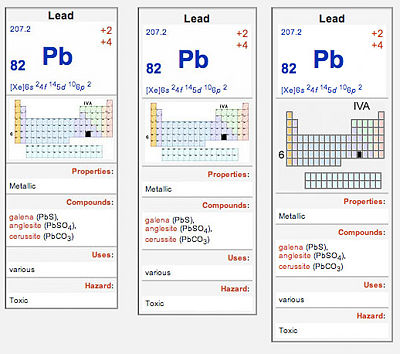
Robert, here is a screen shot from my browser, is this what you are seeing?
In this example, the one up as I post, I have included a simplfied periodic table. The text (6 and IVA) ned to be bigger in the picture. Also the box lines need to be thicker and the atomic numbers axed too. I did not have time to get it perfect, but you get the idea.
I prefer the one on the right with extra padding so the dividing lines don't go all the way across. I think more work on the background colours is needed. However, if mine looks completely different to yours there are more fundamental issues to solve. I did delete out a lot of code that was not necessary, for my browswer at least. It might be required for IE? Chris Day 12:06, 4 April 2008 (CDT)
- I'm not worried about the padding, it looks fine either way. And I agree with the current picture of the table, it looks better. Less is definately more. But this is what I'm talking about . --Robert W King 12:11, 4 April 2008 (CDT)

