Template talk:Elem Infobox: Difference between revisions
imported>Robert W King |
imported>Robert W King |
||
| Line 42: | Line 42: | ||
I prefer the one on the right with extra padding so the dividing lines don't go all the way across. I think more work on the background colours is needed. However, if mine looks completely different to yours there are more fundamental issues to solve. I did delete out a lot of code that was not necessary, for my browswer at least. It might be required for IE? [[User:Chris Day|Chris Day]] 12:06, 4 April 2008 (CDT) | I prefer the one on the right with extra padding so the dividing lines don't go all the way across. I think more work on the background colours is needed. However, if mine looks completely different to yours there are more fundamental issues to solve. I did delete out a lot of code that was not necessary, for my browswer at least. It might be required for IE? [[User:Chris Day|Chris Day]] 12:06, 4 April 2008 (CDT) | ||
:I'm not worried about the padding, it looks fine either way. And I agree with the current picture of the table, it looks better. Less is definately more. But this is what I'm talking about [[Image:Needsfix.jpg|thumb|right|150px|The left side has an errant column that needs removing]]. Also notice, my text is not left-justified. --[[User:Robert W King|Robert W King]] 12:11, 4 April 2008 (CDT) | :I'm not worried about the padding, it looks fine either way. And I agree with the current picture of the table, it looks better. Less is definately more. But this is what I'm talking about [[Image:Needsfix.jpg|thumb|right|150px|The left side has an errant column that needs removing]]. Also notice, my text is not left-justified. --[[User:Robert W King|Robert W King]] 12:11, 4 April 2008 (CDT) | ||
==Periodicity within the template== | |||
Instead of including a miniature picture, why not just code it into the template so you can put the "IVA" on the top and "6" on the left? I'm not thrilled by the prospect of having to create jpeg pictographs for every single element. | |||
Revision as of 11:17, 4 April 2008
Chem_Infobox
- background1=aaccff (the color of the background)
- elementColor=xxxxxx (the color of the element square)
- elName=Helium (element name)
- elMass=0 (element mass)
- elSym=He (element symbol)
- elNum=2 (atomic number)
- eltrnCfg=1-1 (electron confguration
- no1=1 (oxidation states)
- no2=1
- no3=1
- no4=1
- properties=Describe what it looks like
- compounds=What is it found in?
- uses=(uses)
- hazard=what type of hazard does it pose?
what does element color mean?
I don't see anywhere what the definition is for the elementColor variable. Is there a set of colors which indicate something about the element or is it up to each element author to choose any color they like? I just kept a red color for my Boron page. Is this correct? Does it matter? David E. Volk 09:33, 6 December 2007 (CST)
Fix
There's a white margin on the left side that needs to be fixed. Also, I think some elements are better left justified, while some look better centered (I don't think they should all be centered). Thirdly, I think the picture being there is somewhat worthless. Instead we should be giving the period in which it resides so people can look it up in a much better formatted table, if they wish. --Robert W King 09:19, 4 April 2008 (CDT)
- What do you mean by centered? Could be another browser issue. Chris Day 10:59, 4 April 2008 (CDT)
- The white margin is still there. And I mean center-justified text in some of the tables. --Robert W King 11:06, 4 April 2008 (CDT)
- The white margin on the side is a "keepout" for the article text. Look at all the other structures in CZ...they've got 'em. The page looks crowded otherwise.
- Left-right-center whatever...
- The PT thumbnail is there so the person has a clue where to start looking on the table once they get one with any resolution.
- --David Yamakuchi 12:02, 4 April 2008 (CDT)
- No, this is the only structure that has it. No other templates have this visible margin. Please, I do not wish to get into a debate over this. --Robert W King 12:04, 4 April 2008 (CDT)
- The white margin is still there. And I mean center-justified text in some of the tables. --Robert W King 11:06, 4 April 2008 (CDT)
Screenshot
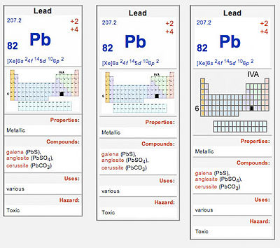
Robert, here is a screen shot from my browser, is this what you are seeing?
In this example, the one up as I post, I have included a simplfied periodic table. The text (6 and IVA) ned to be bigger in the picture. Also the box lines need to be thicker and the atomic numbers axed too. I did not have time to get it perfect, but you get the idea.
I prefer the one on the right with extra padding so the dividing lines don't go all the way across. I think more work on the background colours is needed. However, if mine looks completely different to yours there are more fundamental issues to solve. I did delete out a lot of code that was not necessary, for my browswer at least. It might be required for IE? Chris Day 12:06, 4 April 2008 (CDT)
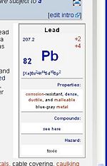
- I'm not worried about the padding, it looks fine either way. And I agree with the current picture of the table, it looks better. Less is definately more. But this is what I'm talking about . Also notice, my text is not left-justified. --Robert W King 12:11, 4 April 2008 (CDT)
Periodicity within the template
Instead of including a miniature picture, why not just code it into the template so you can put the "IVA" on the top and "6" on the left? I'm not thrilled by the prospect of having to create jpeg pictographs for every single element.

